How To Unlock the Secrets of Video Game Inventory UX Design
The Acagamic Tip Tuesday #52
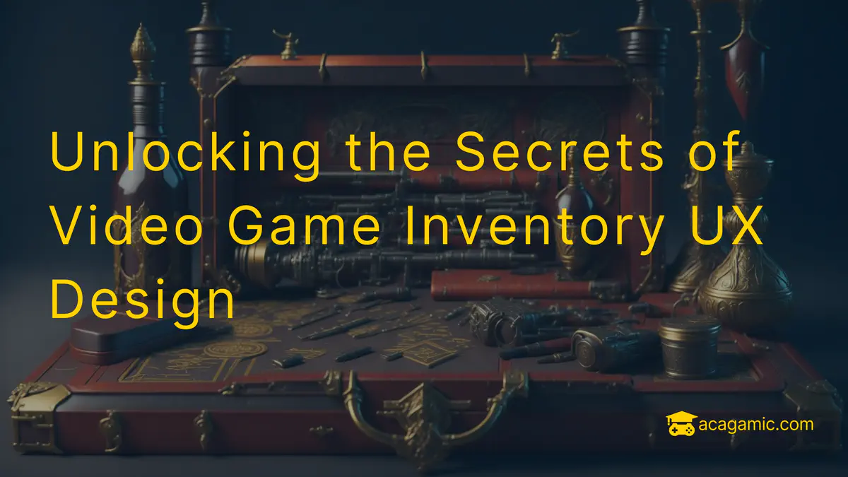 A Game Inventory UI
When it comes to UX design in games, inventory systems are often an overlooked aspect that can make or break the player experience. A game’s overall success depends on how well its inventory is made, because this affects both how easy it is to use and how immersed you feel in the game. Inventory UX design should be easy to understand and efficient so that players can manage their items without stopping the flow of the game. Adding visual cues and organization can also help the player feel like they are making progress and getting better at the game. So, what are the challenges and opportunities of designing a game’s inventory? And what are the different methods that game designers use to make inventory systems that work well and are fun to use?
Striking a Balance: Functionality and Aesthetics
Finding the right balance between functionality and looks is one of the most difficult parts of designing an inventory. Players want their inventory to look good and fit the theme of the game world, but it also needs to be easy to use and work well. One way designers can strike this balance is by making sure that the most common tasks are reflected in the inventory and that frequently used items are easy to find. For example, the Zelda series has experienced both successes and failures in this regard. In Ocarina of Time, the need to constantly access the Iron Boots—which were classified as equipment rather than items—in the inventory in the infamous Water Temple made the level even more frustrating. This required players to repeatedly navigate through menus, significantly slowing down gameplay. However, in later iterations of the series, these issues were addressed, streamlining the inventory experience and making the games more enjoyable. You might remember the original release of “Resident Evil 4,” where the Attache Case inventory system—while visually appealing and thematic—forced players to spend significant time managing and rearranging items to fit them in the limited space provided. This tedious inventory management interrupted the pacing of the game and added frustration. However, in subsequent titles in the series, inventory systems were refined, reducing micromanagement and offering a smoother gameplay experience.
So, how would we find out if the inventory systems in our game prototype strike the right balance between functionality and aesthetics? Here are some questions you could ask in a user research session:
- How easy is it for you to navigate the inventory system?
- Can you find and access frequently used items quickly?
- How visually appealing do you find the inventory interface?
- Does the inventory layout help or hinder your gameplay experience?
- Are there any elements in the inventory design that you find distracting or unnecessary?
- How would you rate the overall usability of the inventory system?
- Are there any specific improvements you would suggest for the inventory design to enhance its functionality or aesthetics?
- How does the inventory design compare to similar games you have played?
- Do you feel the inventory design contributes positively to your overall gaming experience?
Leveraging Technology: The Power of a Second Screen
Some games, such as The Wind Waker port on the Wii U, have been able to leverage a second screen to improve inventory management. By touching the screen on the controller, players can get to their inventory quickly and easily without stopping the game. This method not only makes it easier to use the inventory, but it also improves the overall user experience (UX) without making big changes to how the game was originally made. Also, ZombiU uses the second screen of the GamePad as an inventory system that works in real time. This adds to the tension and immersion by making players keep track of their inventory while still being vulnerable to zombie attacks. Second screens were particularly well used on the Nintendo DS and 3DS systems. Many games (e.g., Pokémon, Professor Layton, and The Legend of Zelda: Phantom Hourglass) on these systems took advantage of the dual-screen setup, with the lower screen often used for inventory management, maps, or additional gameplay elements.
Quick Wheels: Maximizing Efficiency with Limited Buttons
When there isn’t a second screen, game designers have to come up with new ways to make inventory systems easier to use. One such solution is the quick wheel, which uses the precision of an analogue stick to offer multiple item slots for quick access. This allows players to quickly switch between items without having to pause the game or navigate through menus, making gameplay more efficient and enjoyable. The quick wheel has become a popular feature in many modern games, especially those that are designed for consoles with limited buttons.
In Dishonored, for example, a radial quick wheel lets players quickly access their skills and gear. Players can pause the game by holding down a button, and then use the analogue stick to choose the desired power or item. This lets them switch between tools quickly without having to go through menus. The Ratchet & Clank series features a weapon quick wheel, which lets players cycle through their arsenal with ease. By holding down a button, a radial menu appears, displaying all the available weapons. Players can then use the analogue stick to select their desired weapon, making it easy to change strategies during combat. In Red Dead Redemption 2, the quick wheel is used for managing weapons, items, and provisions. By holding down a button, players can access a radial menu divided into multiple sections for weapons, consumables, and other items. The analogue stick is then used to navigate the wheel and make selections, allowing players to quickly access and manage their inventory in the heat of battle. By providing players with more slots, the need to navigate through menus is reduced, resulting in a more efficient and enjoyable UX.
Managing Time: How Inventory Affects the Game World
Another crucial part of designing an inventory is figuring out what should happen in the game world while the player looks at their inventory. Designers must decide whether the game world should stop, slow down, or continue as the player manages their inventory. Each choice has pros and cons and can have a big effect on the UX, so it’s important to think about the game’s core values and how you want the player to feel. Player feedback can also be factored in when deciding how to design an inventory. Listening to player experiences and preferences can help designers craft an inventory system that is intuitive and enjoyable to use. Ultimately, the goal should be to create an inventory system that is both functional and enjoyable for the player. There are essentially three ways of designing your inventory’s user interface in the game:
- Stop: When a player is in their inventory, pausing the game completely gives them a safe place to think about their next moves, plan their strategies, and organize their items without feeling rushed. This method works well in games where players need time to think and make decisions because it gives them a sense of control and calm. In fast-paced or action-oriented games, it can also break immersion and flow.
- Slow down: Slowing down time while the player looks at their inventory is an excellent way to keep them in the game while also giving them time to plan. In games like DOOM, the weapon wheel slows down time so that players can choose their next weapon without stopping the fast-paced combat. This method can help maintain a sense of urgency and tension while still giving people a chance to make decisions.
- Continue: Games like Dark Souls and ZombiU make the experience more immersive and difficult by letting the game world keep going while the player interacts with their inventory. This way, players have to be aware of their surroundings and wait until it’s safe to open their inventory, which adds a new layer of strategy and risk. But it can also be frustrating if the inventory system isn’t quick and easy to use, because players may find it hard to keep track of their items when they’re always in danger.
The inventory system is the one part of the game that allows players to view and use their items. This is usually done by pressing a button on the controller, and if the player is in danger, it might be hard to use. This is similar to trying to unlock a door in the dark when you can’t find the key. You fumble around, desperately trying to figure out how to open the door, but it’s hard to focus when you know something terrible is coming.
The Infinite Puzzle of Inventory Design
To conclude, building a video game inventory is complicated and multifaceted. It needs to strike a balance between how it looks, how it works, and how it makes the player feel. To make a sound inventory system, you must combine technical knowledge with creative design. It also needs to be tailored to the type of game and the genre that it is in. Ultimately, it should be an enjoyable experience for the player. For instance, an inventory system for a role-playing game should focus on giving the player freedom to customize their character, while an inventory system for a first-person shooter should focus on giving the player the tools they need to succeed in the game’s battles. Take into account the game’s core values and how the player feels and you can create creative and fun inventory systems. Ultimately, designing an inventory is both an art and a science. It is like baking a cake: you need to get the right ingredients in the right proportions, but you also need to know how to mix and combine them to create something delicious and unique.
Lennart Nacke, PhD
Professor
Hey there, I am a Professor and the Research Director of the HCI Games Group at the University of Waterloo in Canada. I am a world-leading expert on what makes games engaging and how we can use them to improve products, systems, and services. My research is widely discussed and recognized by the New Yorker, Forbes, MIT Technology Review, CTV News, New Scientist, The Daily Mail, PC Gamer Magazine, and elsewhere. I have edited a textbook on Games User Research and authored hundreds of academic articles in gamification, user experience research, human-computer interaction, and game design.